The final design of drawing first, and then sketching took a very long time to complete, partly due to my urge of wanting to be perfect, and partly due to my apparently (very) inadequate skills in photoshop. Well at least I learnt quite some things there. Drawing the roughs out took a long time, but the true problem came in scanning and photoshopping the entire image.
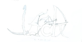 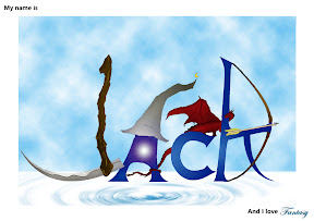 |
| Fantasy Final |
The Fantasy image felt simple until I realise the difficulty in trying to make a realistic colouring/shading combi for the scythe. And that was the beginning of my problems. The hat was ok, but the dragon was simply... Oh My God. I loved this dragon ( which I named aptly, Alucard for my favourite anime character) but illustrating him was a pain in the... In the end I had to redraw the entire dragon with mouse which was much harder than it looks without stylus or those tools. Rippling the effect came later with some online tutorials which I was pretty happy about, and I managed to curl a few of the letters together with the dragon tail. After that I went with a white background cause I loved the colour white and gave it some misty cloudy feel as background, and finished off the letters witha shading of blue. All these took incredibly long... maybe like 3 days? Mainly due to my lack of photoshopping skills. But the effect was nice... I liked the rippling effect especially.
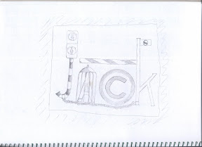 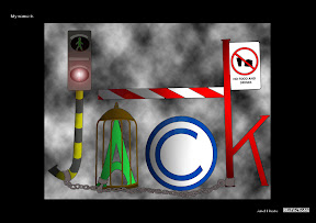 |
| Restriction Final Sketch and the completed edit |
The restrictions part I finished faster because I learnt alot from working on Fantasy. Simply define each letter, then illustrate them all, and colour. The difficult part came in details again... I realised the chains which I added was extremely difficult to copy over... so bad news... back to.. mouse drawing again.. Each chain by chain... That was a painful process which still chills me, so I won't recount it. Needless to say, I endured through and ended up with a rather nice effect. (which sadly, I actually liked better than my Fantasy) I bordered it black to contrast with Fantasy, and filled the inner with smoke to give a very congested, choked feeling. Added a signboard with a no food and drinks sign ( no, I DONT HATE TRAFFIC SIGNS) and called it a day. The effort was excruciating, but at least, I guess the class appreciated my efforts ( I think). Still, Please comment on it if you think There's more places that could be changed.
Strange to say this, but I look forward to the next assignment.
2 comments:
Your original sketches looks great and detailed. Every lettering of your name shows something to the audience. Fantasy and restrictions are clearly shown to be your likes and dislikes. I like your finished work too! Great work there! =]
Loved looking at your assignment. You have a artistic hand ---- do develop it. Do upload your thumbnails and roughs too.
Post a Comment