  |
| Fantasy Sketches |
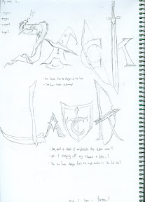
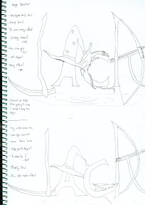
I really like my dragon in the first idea... well the curl of the tail that is. And i like that hat too... Looks kinda cute. I think the scythe on the second one looks nice... and the bow looks nice too. Well I won't choose the third one... Simply cause it's extremely difficult to pull off and it might not be very fitting... The last one was refreshing from where I saw it, but not many people even got the idea, much less like it, so yeah... Ultimately I decided on a merge between the first and second ideas. I do realise the first and second bear a similarity in that both have very distinct differences in the letters... And in that sense there is little sense of continuity. Well, I was actually gunning for weapons as the theme for the second sketch and a more generic fantasy feel for the first, but taking that into consideration, I added some notes in mind: to give the whole picture a continuity, either in terms of colour in the letters , or adding something to join them all.
But before I go on to the rough, I should think of the next part of the assignment: I hate.
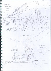
It wasn't long before I came to a more satisfactory idea ( among others, which included things like, " I hate pink", or " I hate power puff" , but I honestly don't want any pink-lovers or power puff fans to dislike me from the first lesson) : Restrictions. I was thinking, piece-a-cake, i'll jsut draw signboards. Easy, right?
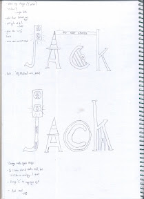
No. In fact after I started off I regretted it, because restrictions is an abstract idea. Drawing lots of signboards are like saying I hate traffic signs. Well I stuck with some, and ended up something as you see now.
  |
| Restrictions Sketches |
I got surprisingly light hearted comments for the second sketch, and people actually liked it. So well, with that in mind, it was down to Roughs.
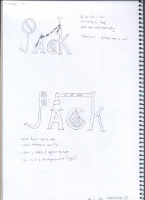
Well. in the end, for my Fantasy rough, I got 2 pretty similar designs, with various tones to the different letters. First rough was a more aggressive tone, with a poaching dragon, while the second one had a more docile sleeping dragon. I also added a ripple effect at the bottom to signify a floating feeling, that assigns a form of continuity btn the letters, having "joined" by the ripple design.
  |
| Fantasy and Restriction Roughs |
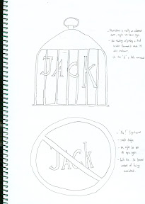
Restriction wise was simpler, I just did some changes to the simple designs of the traffic lights, ad added something I came up with: the copyright symbol for the letter "C". In the end I was generally satisfied with the results of the font, for it conveyed a more light-hearted, "Ally McBeal" feeling... Maybe it's just me.
No comments:
Post a Comment