Presented my assignment on Monday... well was a little disappointing again because I had to present at the small classroom when everyone had left and I had to skip a lesson, but besides that, I got pretty nice comments about the bearbear idea...
Yep, in the end decided to present the bearbear idea, since I wasn't so sure on which one to present at that time. Ultimately, I'll probably still submit the simple love story into the portfolio. Still, peeps who have yet to see my story, do take a look and give me your comments. ^^ Thanks.
Friday, February 16, 2007
Assignment 3: Some silly bearbears
haha~ Well, after doing the actual assignment, I was in the mood to have some fun, so I invited my gf over to my place, and we started to mess around with the bearbear idea. Well, we started to brain storm for ideas and finally decided on a simple idea. Here, this is for your enjoyment ^^ Hope you liked it, and do comment, if you think its interesting~
There. ^^ Hope it's as interesting for you as it is for me when I made it. I'll probably frame both up, because I really like this idea too. ^^ Comments are deeply appreciated.
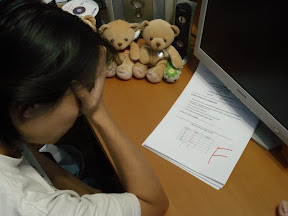 |
| Omg... I failed my test... T_T From 3: Bearbear s... |
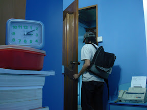 |
| Sigh, heading out for some time on my own.. From 3: Bearbear s... |
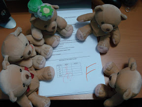 |
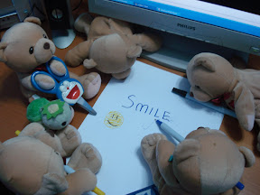
| Bearbears are crowding around to see... From 3: Bearbear s... |
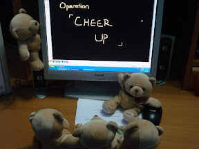 |
| ... And July bearbear has decided on an operation! Briefing time! From 3: Bearbear s... |
 |
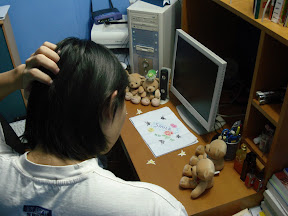
| Gathering materials and brain storming... From 3: Bearbear s... |
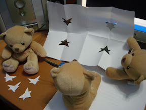 |
| Cutting stars... Look at the left bear counting stars, isn't he adorable ^^ From 3: Bearbear s... |
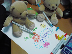 |
| Bears in charge of colouring.. From 3: Bearbear s... |
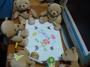 |
| Reviewing the final product... From 3: Bearbear s... |
 |
| I'm home... From 3: Bearbear s... |
 |
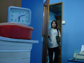
| Hm... eh? What's this? From 3: Bearbear s... |
There. ^^ Hope it's as interesting for you as it is for me when I made it. I'll probably frame both up, because I really like this idea too. ^^ Comments are deeply appreciated.
Assignment 3: Love that almost was...
This assignment is a tricky one to tackle. In the idea generation phase, I was stuck for quite a bit on good ideas and generally couldn't decide.
Ultimately here are some of the ideas I came up with:
- My pet is lost
I lost my pet! Where is it? I'm going downstairs to find it... where can it be I wonder.
- A Late Night Snack
I'm a hungry man. Where are the cookies? And who turned the mains off?
- A Simple Love Story
Everyday I stood from afar, looking at her... She's leaving, and I got to stop her..
- A Bearbear Story
When I left the house, little bearbears come out to play...
After much thought process, I narrowed down back to 2 - the love story and the bearbear story. The love story because it really appealed to me, and the bearbear story for its simplicity and its cute and fun-to-do nature. Designer's choice yet again...
A brief Thank You...
To those who have posted some comments on this blog, be it passer-by's or people from the course, thank you ^^
I'll post some interesting pictures up soon for the assignment 3.. so stay tuned!
I'll post some interesting pictures up soon for the assignment 3.. so stay tuned!
Monday, February 5, 2007
Assignment 2: A finished Furisode
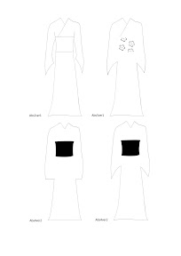
There.. That's done. After much labouring with many design issues, I've finally decided on a few design which I think I'm happy with, both the abstraction and the generic.
The class reaction to my Furisode was strangely silent... There wasn't a compliment or a comment... Just a question about the Furisode. Well it was a little awkward and I guess a little disappointing, but I guess I cant expect everyone to like kimonos... If you do have any comments about my kimono but didn't say anything in class, do feel free to comment on it. ^^
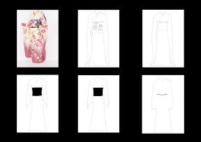
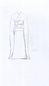
These are the design I wanted to put on the kimono, which I eventually scrapped. The aim is focus on the kimono rather than the designs. Still, if you're interested here's a peek at it. Nothing fanciful though.
Well I'll see you soon in a hopefully better third assignment.
  |
| The kimono forms of abstraction and the symbol |
The class reaction to my Furisode was strangely silent... There wasn't a compliment or a comment... Just a question about the Furisode. Well it was a little awkward and I guess a little disappointing, but I guess I cant expect everyone to like kimonos... If you do have any comments about my kimono but didn't say anything in class, do feel free to comment on it. ^^
 |
| Many alternate designs I scrapped |
These are the design I wanted to put on the kimono, which I eventually scrapped. The aim is focus on the kimono rather than the designs. Still, if you're interested here's a peek at it. Nothing fanciful though.
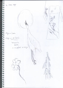 |
| Some cranes and stuff that friends suggested. |
Well I'll see you soon in a hopefully better third assignment.
Sunday, February 4, 2007
Assignment 2: Kimono Frenzy
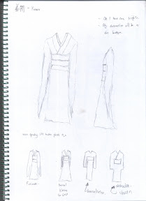
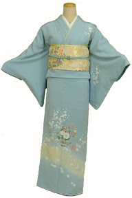
Well, after much research on the traditional kimono, I have gathered ample knowledge to start work. Not much could be said for the drawing process, though I was satisfied with how the drawings turned out. ( On a side note, a kimono without the human figure in it, especially the ones I drew, felt eerie... like a headless ghost >_< )
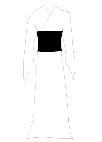
I went on to refine and drew a satisfactory kimono as shown below. And beside it is a kimono photo that would appear in the final cut.
What I feel that is worth mentioning is the final abstraction process. In fact it was the most time consuming process, ( besides the brainstorming for ideas) and I ended up with a lot of different versions of my abstractions.. I guess most people might have encountered the same problem. Well, it boiled down to a matter of choice again. Maybe I'll print all of them out, just to display them in class when we ask for opinions and such.
Hm, should i add a shadow for the kimono? Hmm... design seems to incooperate alot of decision making..
 |
| Kimono I drew as conceptual sketches. |
I went on to refine and drew a satisfactory kimono as shown below. And beside it is a kimono photo that would appear in the final cut.
 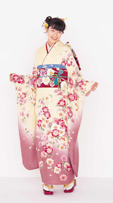 |
| The final Kimono I chose to do and headless kimono O_o |
What I feel that is worth mentioning is the final abstraction process. In fact it was the most time consuming process, ( besides the brainstorming for ideas) and I ended up with a lot of different versions of my abstractions.. I guess most people might have encountered the same problem. Well, it boiled down to a matter of choice again. Maybe I'll print all of them out, just to display them in class when we ask for opinions and such.
Hm, should i add a shadow for the kimono? Hmm... design seems to incooperate alot of decision making..
Assignment 2: Abstraction as a form of Art
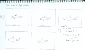
Well, the classroom assignment sounded fairly simple... to design something that you can identify with iconically and indexically... so me andDan came up with some basic ideas about stuff, like common objects... Then I thought about water... islands... and ended up with... SHARKS! I like sharks, they give a powerful image and are a form of beauty. Personally I wouldn't get close to a shark unless we're separated by aquarium glass, but I thought it was still a worthwhile idea.
Yeah, the only problem stemmed from the fact that I couldn't draw them properly in such a short time. Gonna have to research on them to draw them I guess.
Since then, I have been plagued with design ideas. What should I do as a form of abstraction? I did alot of brainstorming, and here are some of the ideas I came up with:
( in no order of preference, )
- vehicles
- cooking utensils
- stationery
- weapons
- animals
- Buildings
- Fishes
- Sharks
After which I decided on sharks.,since I already drew them once in class. So I toiled and researched and drawn a nice shark.
But then, I gave up the idea. Why, you may ask... Well it's really a question of preference. I wasn't satisfied with the idea of sharks... really. It didn't give me a good enough feeling. Yeah... I depend alot on feeling when I design and draw, so when the idea of a shark came up, I thought it was good. But after I drawn a nice, satisfactory shark, I looked back, and I didn't fancy the idea so much. Well, firstly, it's a pretty common creature. It wasn't unique... And plus I already drawn a (horrible looking) shark for the classroom assignment, so I wanted something more out of it. I wanted a unique idea.
So brainstorming session again.
This next brainstorming session was more fruitful, and I came up with a list of pretty unique ideas.
- Mask ( from Bleach =P)
- Toilet Bowl
- Treasure Chest
- Helmet
- Snowflake
- Castle
- Mythical creatures, eg. Dragon, 9 tailed fox
- Guns, weaponry
- Horror eg, ghosts
- Skull
- Kimono
- Shooting Star
- Coffin
(The ones in bold are ideas I liked )
Yeah, a pretty long list. Well, I could keep coming up with ideas, but then I wouldn't have time to illustrate it and finish it. As Dr Reddy mentioned in his lecture, you gotta finally stick with one design, and go with it, or else you'd never finish anything. Yeah, so well, what did i choose in the end?
Kimonos. Why Kimonos? Question of choice again... The rest just dont seem to fit... especially presenting a skull in class? A coffin? Hm, might be abit of an extreme... There will be a group who likes it, and people who don't. I was looking for a more neutral, milder and more gentler idea. The other ideas were scrapped for various reasons. So here we have it... The kimono idea. I really hope it turns out well, since it's pretty unique and I think... not many people would do it? Hope so >_< Oh and if you prefer my shark rather than my kimono... Gomenasai. It's not that I don't like my shark, but I was just looking at something more... unique.
Yeah, the only problem stemmed from the fact that I couldn't draw them properly in such a short time. Gonna have to research on them to draw them I guess.
Since then, I have been plagued with design ideas. What should I do as a form of abstraction? I did alot of brainstorming, and here are some of the ideas I came up with:
( in no order of preference, )
- vehicles
- cooking utensils
- stationery
- weapons
- animals
- Buildings
- Fishes
- Sharks
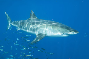 |
| A scary Great White |
After which I decided on sharks.,since I already drew them once in class. So I toiled and researched and drawn a nice shark.
 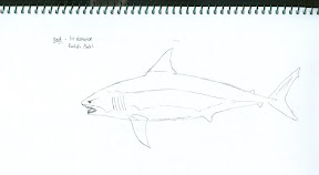 |
| I like the shark end product.. |
But then, I gave up the idea. Why, you may ask... Well it's really a question of preference. I wasn't satisfied with the idea of sharks... really. It didn't give me a good enough feeling. Yeah... I depend alot on feeling when I design and draw, so when the idea of a shark came up, I thought it was good. But after I drawn a nice, satisfactory shark, I looked back, and I didn't fancy the idea so much. Well, firstly, it's a pretty common creature. It wasn't unique... And plus I already drawn a (horrible looking) shark for the classroom assignment, so I wanted something more out of it. I wanted a unique idea.
So brainstorming session again.
This next brainstorming session was more fruitful, and I came up with a list of pretty unique ideas.
- Mask ( from Bleach =P)
- Toilet Bowl
- Treasure Chest
- Helmet
- Snowflake
- Castle
- Mythical creatures, eg. Dragon, 9 tailed fox
- Guns, weaponry
- Horror eg, ghosts
- Skull
- Kimono
- Shooting Star
- Coffin
(The ones in bold are ideas I liked )
Yeah, a pretty long list. Well, I could keep coming up with ideas, but then I wouldn't have time to illustrate it and finish it. As Dr Reddy mentioned in his lecture, you gotta finally stick with one design, and go with it, or else you'd never finish anything. Yeah, so well, what did i choose in the end?
 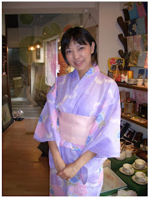 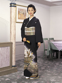 |
| Kimonos for research |
Kimonos. Why Kimonos? Question of choice again... The rest just dont seem to fit... especially presenting a skull in class? A coffin? Hm, might be abit of an extreme... There will be a group who likes it, and people who don't. I was looking for a more neutral, milder and more gentler idea. The other ideas were scrapped for various reasons. So here we have it... The kimono idea. I really hope it turns out well, since it's pretty unique and I think... not many people would do it? Hope so >_< Oh and if you prefer my shark rather than my kimono... Gomenasai. It's not that I don't like my shark, but I was just looking at something more... unique.
Saturday, February 3, 2007
Assignment 1: A finished Me
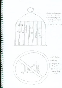
Well, upon showing my drawings to the class, I guess the general response could be said as... agreeable. Fantasy wasn't really that much different, so there wasn't much to comment on, while the Restrictions had 2 comments: to remove the cone and to perhaps, use the idea of the cage on what of the letters. And also to include that do not cross tape somewhere. Well, I'm truly glad someone appreciated my restriction design and said it was easy to see on first glance.
The final design of drawing first, and then sketching took a very long time to complete, partly due to my urge of wanting to be perfect, and partly due to my apparently (very) inadequate skills in photoshop. Well at least I learnt quite some things there. Drawing the roughs out took a long time, but the true problem came in scanning and photoshopping the entire image.
The Fantasy image felt simple until I realise the difficulty in trying to make a realistic colouring/shading combi for the scythe. And that was the beginning of my problems. The hat was ok, but the dragon was simply... Oh My God. I loved this dragon ( which I named aptly, Alucard for my favourite anime character) but illustrating him was a pain in the... In the end I had to redraw the entire dragon with mouse which was much harder than it looks without stylus or those tools. Rippling the effect came later with some online tutorials which I was pretty happy about, and I managed to curl a few of the letters together with the dragon tail. After that I went with a white background cause I loved the colour white and gave it some misty cloudy feel as background, and finished off the letters witha shading of blue. All these took incredibly long... maybe like 3 days? Mainly due to my lack of photoshopping skills. But the effect was nice... I liked the rippling effect especially.
The restrictions part I finished faster because I learnt alot from working on Fantasy. Simply define each letter, then illustrate them all, and colour. The difficult part came in details again... I realised the chains which I added was extremely difficult to copy over... so bad news... back to.. mouse drawing again.. Each chain by chain... That was a painful process which still chills me, so I won't recount it. Needless to say, I endured through and ended up with a rather nice effect. (which sadly, I actually liked better than my Fantasy) I bordered it black to contrast with Fantasy, and filled the inner with smoke to give a very congested, choked feeling. Added a signboard with a no food and drinks sign ( no, I DONT HATE TRAFFIC SIGNS) and called it a day. The effort was excruciating, but at least, I guess the class appreciated my efforts ( I think). Still, Please comment on it if you think There's more places that could be changed.
Strange to say this, but I look forward to the next assignment.
The final design of drawing first, and then sketching took a very long time to complete, partly due to my urge of wanting to be perfect, and partly due to my apparently (very) inadequate skills in photoshop. Well at least I learnt quite some things there. Drawing the roughs out took a long time, but the true problem came in scanning and photoshopping the entire image.
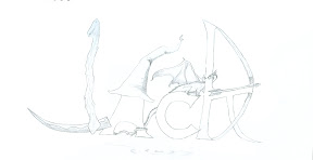 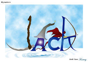 |
| Fantasy Final |
The Fantasy image felt simple until I realise the difficulty in trying to make a realistic colouring/shading combi for the scythe. And that was the beginning of my problems. The hat was ok, but the dragon was simply... Oh My God. I loved this dragon ( which I named aptly, Alucard for my favourite anime character) but illustrating him was a pain in the... In the end I had to redraw the entire dragon with mouse which was much harder than it looks without stylus or those tools. Rippling the effect came later with some online tutorials which I was pretty happy about, and I managed to curl a few of the letters together with the dragon tail. After that I went with a white background cause I loved the colour white and gave it some misty cloudy feel as background, and finished off the letters witha shading of blue. All these took incredibly long... maybe like 3 days? Mainly due to my lack of photoshopping skills. But the effect was nice... I liked the rippling effect especially.
 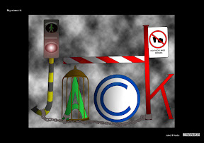 |
| Restriction Final Sketch and the completed edit |
The restrictions part I finished faster because I learnt alot from working on Fantasy. Simply define each letter, then illustrate them all, and colour. The difficult part came in details again... I realised the chains which I added was extremely difficult to copy over... so bad news... back to.. mouse drawing again.. Each chain by chain... That was a painful process which still chills me, so I won't recount it. Needless to say, I endured through and ended up with a rather nice effect. (which sadly, I actually liked better than my Fantasy) I bordered it black to contrast with Fantasy, and filled the inner with smoke to give a very congested, choked feeling. Added a signboard with a no food and drinks sign ( no, I DONT HATE TRAFFIC SIGNS) and called it a day. The effort was excruciating, but at least, I guess the class appreciated my efforts ( I think). Still, Please comment on it if you think There's more places that could be changed.
Strange to say this, but I look forward to the next assignment.
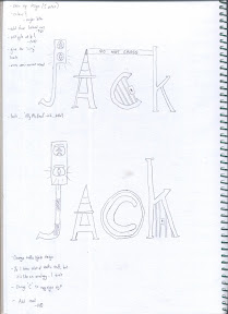
Assignment 1: About Me
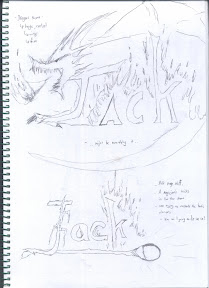
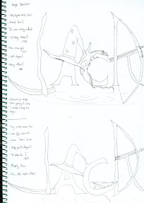
This assignment is a deceptively simple one. And one that I took quite sometime to think about what I wanted to add. In fact it was difficult to decide on one theme because there were just so many things I like... I like reading, games, movies, fantasy stuff, music, animes (like Bleach and Deathnote) among others. This is a big headache, so after brainstorming I sorta started idle doodling some about fantasy related stuff... Wasn't long before I got fully involved in the idea and got really serious about it... and settled on it... I love.. .Fantasy!
I really like my dragon in the first idea... well the curl of the tail that is. And i like that hat too... Looks kinda cute. I think the scythe on the second one looks nice... and the bow looks nice too. Well I won't choose the third one... Simply cause it's extremely difficult to pull off and it might not be very fitting... The last one was refreshing from where I saw it, but not many people even got the idea, much less like it, so yeah... Ultimately I decided on a merge between the first and second ideas. I do realise the first and second bear a similarity in that both have very distinct differences in the letters... And in that sense there is little sense of continuity. Well, I was actually gunning for weapons as the theme for the second sketch and a more generic fantasy feel for the first, but taking that into consideration, I added some notes in mind: to give the whole picture a continuity, either in terms of colour in the letters , or adding something to join them all.
But before I go on to the rough, I should think of the next part of the assignment: I hate.
It wasn't long before I came to a more satisfactory idea ( among others, which included things like, " I hate pink", or " I hate power puff" , but I honestly don't want any pink-lovers or power puff fans to dislike me from the first lesson) : Restrictions. I was thinking, piece-a-cake, i'll jsut draw signboards. Easy, right?
No. In fact after I started off I regretted it, because restrictions is an abstract idea. Drawing lots of signboards are like saying I hate traffic signs. Well I stuck with some, and ended up something as you see now.
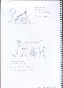
I got surprisingly light hearted comments for the second sketch, and people actually liked it. So well, with that in mind, it was down to Roughs.
Well. in the end, for my Fantasy rough, I got 2 pretty similar designs, with various tones to the different letters. First rough was a more aggressive tone, with a poaching dragon, while the second one had a more docile sleeping dragon. I also added a ripple effect at the bottom to signify a floating feeling, that assigns a form of continuity btn the letters, having "joined" by the ripple design.
Restriction wise was simpler, I just did some changes to the simple designs of the traffic lights, ad added something I came up with: the copyright symbol for the letter "C". In the end I was generally satisfied with the results of the font, for it conveyed a more light-hearted, "Ally McBeal" feeling... Maybe it's just me.
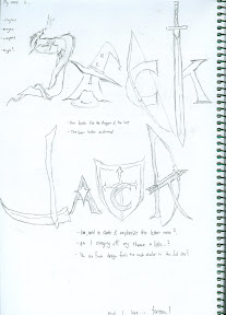  |
| Fantasy Sketches |
I really like my dragon in the first idea... well the curl of the tail that is. And i like that hat too... Looks kinda cute. I think the scythe on the second one looks nice... and the bow looks nice too. Well I won't choose the third one... Simply cause it's extremely difficult to pull off and it might not be very fitting... The last one was refreshing from where I saw it, but not many people even got the idea, much less like it, so yeah... Ultimately I decided on a merge between the first and second ideas. I do realise the first and second bear a similarity in that both have very distinct differences in the letters... And in that sense there is little sense of continuity. Well, I was actually gunning for weapons as the theme for the second sketch and a more generic fantasy feel for the first, but taking that into consideration, I added some notes in mind: to give the whole picture a continuity, either in terms of colour in the letters , or adding something to join them all.
But before I go on to the rough, I should think of the next part of the assignment: I hate.
It wasn't long before I came to a more satisfactory idea ( among others, which included things like, " I hate pink", or " I hate power puff" , but I honestly don't want any pink-lovers or power puff fans to dislike me from the first lesson) : Restrictions. I was thinking, piece-a-cake, i'll jsut draw signboards. Easy, right?
No. In fact after I started off I regretted it, because restrictions is an abstract idea. Drawing lots of signboards are like saying I hate traffic signs. Well I stuck with some, and ended up something as you see now.
  |
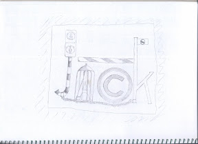
| Restrictions Sketches |
I got surprisingly light hearted comments for the second sketch, and people actually liked it. So well, with that in mind, it was down to Roughs.
Well. in the end, for my Fantasy rough, I got 2 pretty similar designs, with various tones to the different letters. First rough was a more aggressive tone, with a poaching dragon, while the second one had a more docile sleeping dragon. I also added a ripple effect at the bottom to signify a floating feeling, that assigns a form of continuity btn the letters, having "joined" by the ripple design.
  |
| Fantasy and Restriction Roughs |
Restriction wise was simpler, I just did some changes to the simple designs of the traffic lights, ad added something I came up with: the copyright symbol for the letter "C". In the end I was generally satisfied with the results of the font, for it conveyed a more light-hearted, "Ally McBeal" feeling... Maybe it's just me.
Thursday, February 1, 2007
A beginning... And a little bit about myself
A warm welcome, unsuspecting traveller! My name is Jack, and it's nice to meet you. Just a little something about me before you browse through what I have done, to give you an idea what I'm like, and hence, where I get alot of my ideas from.
I'm a Pisces, and I derive pleasure from reading ( Fantasy ), gaming ( generally RPG's, FPS's, Horror and most games with a solid story line ), watching Japanese Anime ( Bleach and Deathnote! And Naruto! Except the fillers, of course.) and generally I'm a fan of mild expression, being a more neutral kind of person. I love the colour white, and enjoy making thoughtful, and deeper works that provokes a meaningful expression, rather than just superficial colours and patterns... Meaning I enjoy making something that has more meaning compared to something that is of a more physical form of beauty. For example, I prefer Da Vinci to Michelangelo, and Claude Monet to Edvard Munch.
I've been thinking long and hard what to include in this blog, to make it less repetitive and more... personal for a reader (which includes myself in years to come) . This is what I decided:
1. I won't include sketches that are purely random in nature
2. I won't include details about sketches
3. I will add feelings and brainstorm ideas
Well, I hope this marks a pleasant journey through the interesting world of creativity and design. To be honest the work is tremendous but the satisfaction that is derived from a complete, admired piece of work is indescribable.
Please leave any comments you may have.. and do leave a little "good" if you think it was worth your time to have taken a peek. ^-^ And of course, I'm always for making new friends, so do feel free to contact me! I can be found on msn at lightyeargazer@hotmail.com.
Subscribe to:
Posts (Atom)